Designing a Conversational Interface to Make Travel Planning Easy
Budget Europe travel is a maze of tabs and forms. We built CheapVoyage 1.0 as a warmer way to find affordable routes — then Google landed on a similar surface, and we pivoted to CheapVoyage 2.0: a conversational planner so finding a cheaper route feels like asking a friend, not filling out a form.
My role
Co-Founder and UX Designer. I owned research, brand, the design system, and the React/Vite frontend. My two co-founders — deep in data science and software — owned backend, databases, scraping, and the search engine. My job was to translate what was technically possible into something travellers would actually use — including saying no when a technical option would make the product harder to trust.
Impact
Seamless trip planning
One conversational thread instead of multi-step forms — people could go from intent to a comparable set of routes without leaving the chat.
Unconventional cheaper options
Price and transfer pain were weighed equally — a slower train could win when it was the smarter trade, not only when it was the cheapest flight.
Easy flight/train comparison
Every suggestion showed the source itinerary — the model assisted without hiding how the answer was built.
Problem
Budget travel across Europe usually means tab-hopping between airlines, train operators, and comparison sites. People know roughly when they want to go, but not which combination of modes will actually be cheapest or least painful. Existing planners either lock you into a destination too early or dump a wall of fares — neither matches how people actually plan: tentatively, with constraints that change mid-sentence.
Building a startup is not the usual UX/UI brief — and that is the point. Affordable travel is a wicked problem: product, tech, business model, and brand all pull on each other. I chose to hold that tension in the design process rather than pretend UX lived in a silo — otherwise we would have shipped a pretty search grid that ignored how the company had to survive.
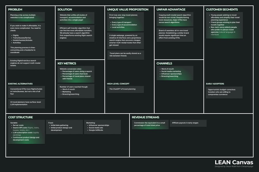
Business frame for a wicked startup problem — not the hero of the story.
Know the traveller
Backpackers often plan a trip start→finish; digital nomads plan fluidly mid-trip — long stays, then the next country by flight, train, ferry, or bus. We designed to cut that overhead for flexible travellers.
We fell in love with the problem before the product. I mapped how people search for, choose, and order travel online — then dug into choosing, not searching or checkout. Searching was noisy and site-specific; ordering was hard to observe without a real purchase. Choosing was where preference showed up: time spent comparing, which factors won, what was merely nice to have.
Affordability beat convenience. A stable connection along the route mattered for people working from the road. And the planning styles split: many backpackers map a trip start→finish; digital nomads often plan fluidly mid-trip — long stays, then decide the next country by flight, train, ferry, or bus. That split mattered for product shape later: a tool that only helped "book the whole tour upfront" would miss the nomad.
I chose to fill the customer canvas before the value proposition. The offer side stayed empty on purpose — a design decision against jumping to features. Untested ideas (like whether layovers could feel like a gain) stayed marked as hypotheses, not requirements.
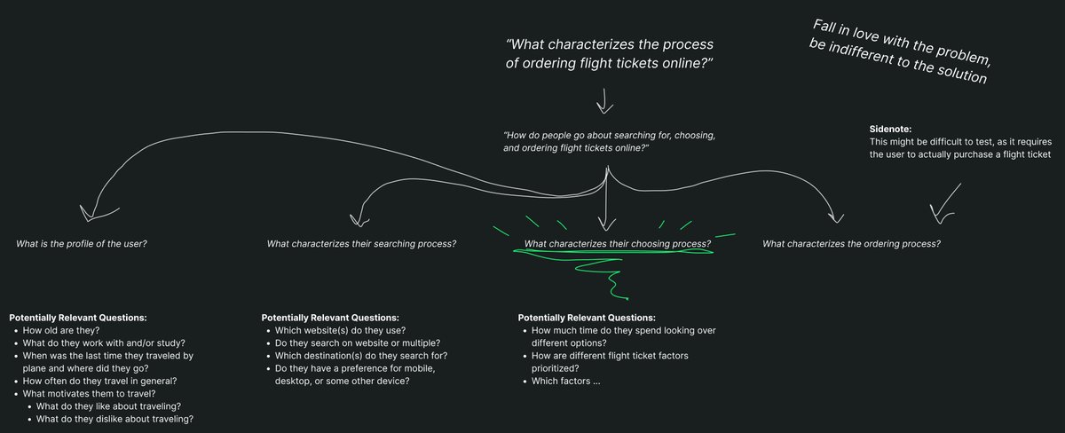
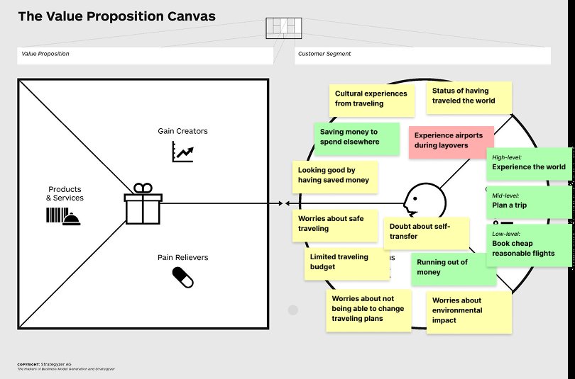
Traveller mapped first; the offer side left blank on purpose. Pink layover sticky = untested hypothesis only.
CheapVoyage 1.0
CheapVoyage 1.0 started as the wrong fantasy — dark mint "hack the system" — then became a warm, trusted product system we actually shipped in React/Vite.
Dark mint with a "hack the system" vibe read clever to us and cold to travellers. I chose against that direction once research made the miss obvious: we were signalling fare-gaming, not going somewhere. Clever-for-founders is not the same as usable-for-travellers.
We rebuilt around adventure and affordability with quiet trust: warm orange and teal, paper texture, modern-analog. The bird with a leaf-wing was a deliberate tradeoff — flight and lightness without adrenaline cosplay, so safety and openness could sit in one mark. Then I pushed past mood boards into a real component system: states, interactions, consistency across flows. I implemented that system in React/Vite while my co-founders owned backend and data — so design intent and frontend behavior stayed one conversation, not a handoff document.
CheapVoyage 1.0 was a shipped product chapter, not a brand exercise. The limit of 1.0 was already visible: even with the right mood, we were still competing as a search surface.
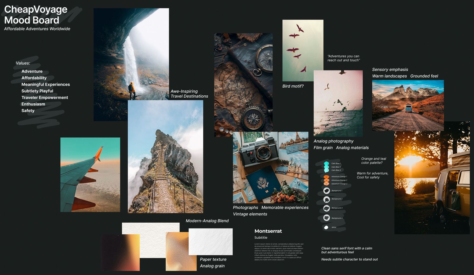
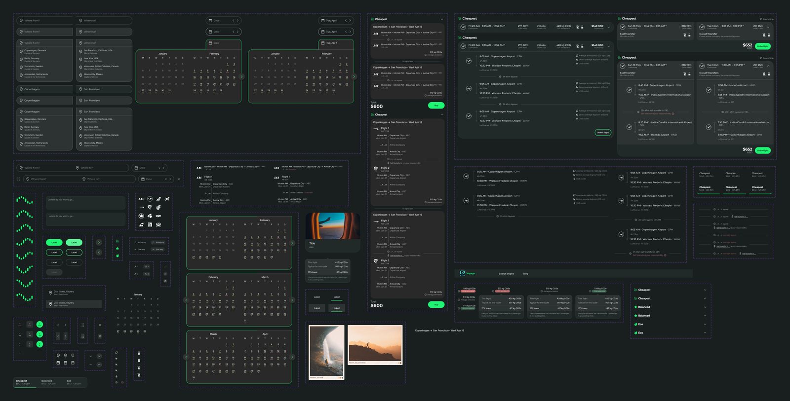
Adventure with trust — then a shipped component system.
The pivot
We couldn't win on a fare grid. We chose conversation.
By spring 2025 we were still on a fare-grid path. In summer 2025 Google Flights launched Flight Deals — essentially the surface we were building. Three founders cannot win an arms race against Google on that UI pattern.
The competitive shock forced a product decision, not a rebrand. We could have doubled down on "slightly different search" — better filters, nicer cards, more modes. We chose not to. Differentiation had to be the experience of planning itself.
The deeper reframe: the burden isn't finding one cheap ticket. It's months of lifestyle travel as a second job — especially for digital nomads deciding the next country mid-trip. CheapVoyage 2.0 had to lighten planning, not sharpen the grid.
Conversation instead of forms
CheapVoyage 2.0 puts constraints in conversation — not a city/date form — so planning stays light and editable.
I chose a conversational interface over another advanced form. Forms force travellers to know too much too early: exact cities, exact dates, exact modes. Conversation lets intent arrive incomplete — where you are, where you might go, for how long, flights or trains — and stay editable mid-thread.
Lightness was a hard constraint, not decoration. Every chrome addition competed with the traveller's mental load. Complexity had to stay in the system: routing, comparisons, data freshness — not in the UI's demand for perfect inputs. "Where to next?" is the product promise in one line: forward motion without a locked itinerary.
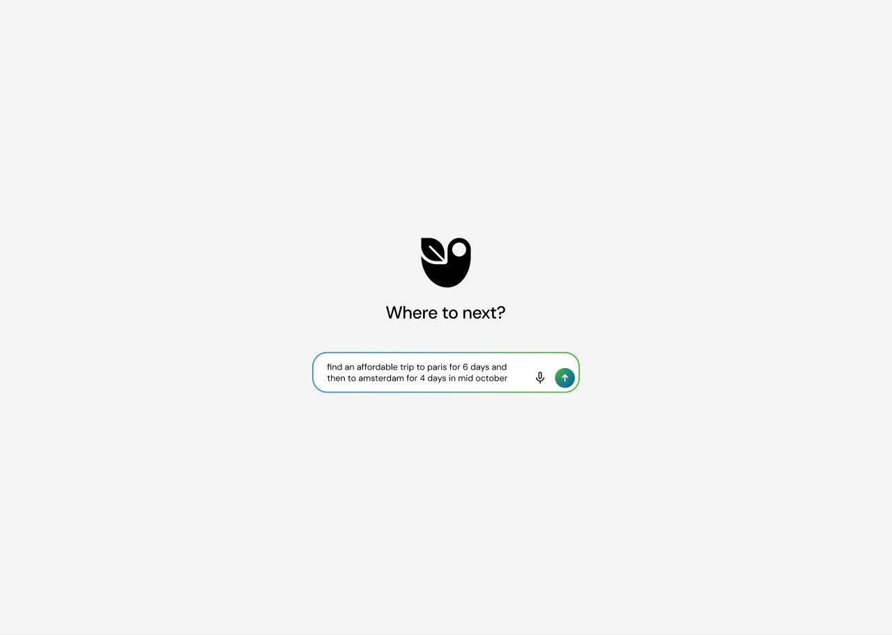 2.0
2.0Constraints in conversation, not a form.
Europe in one thread
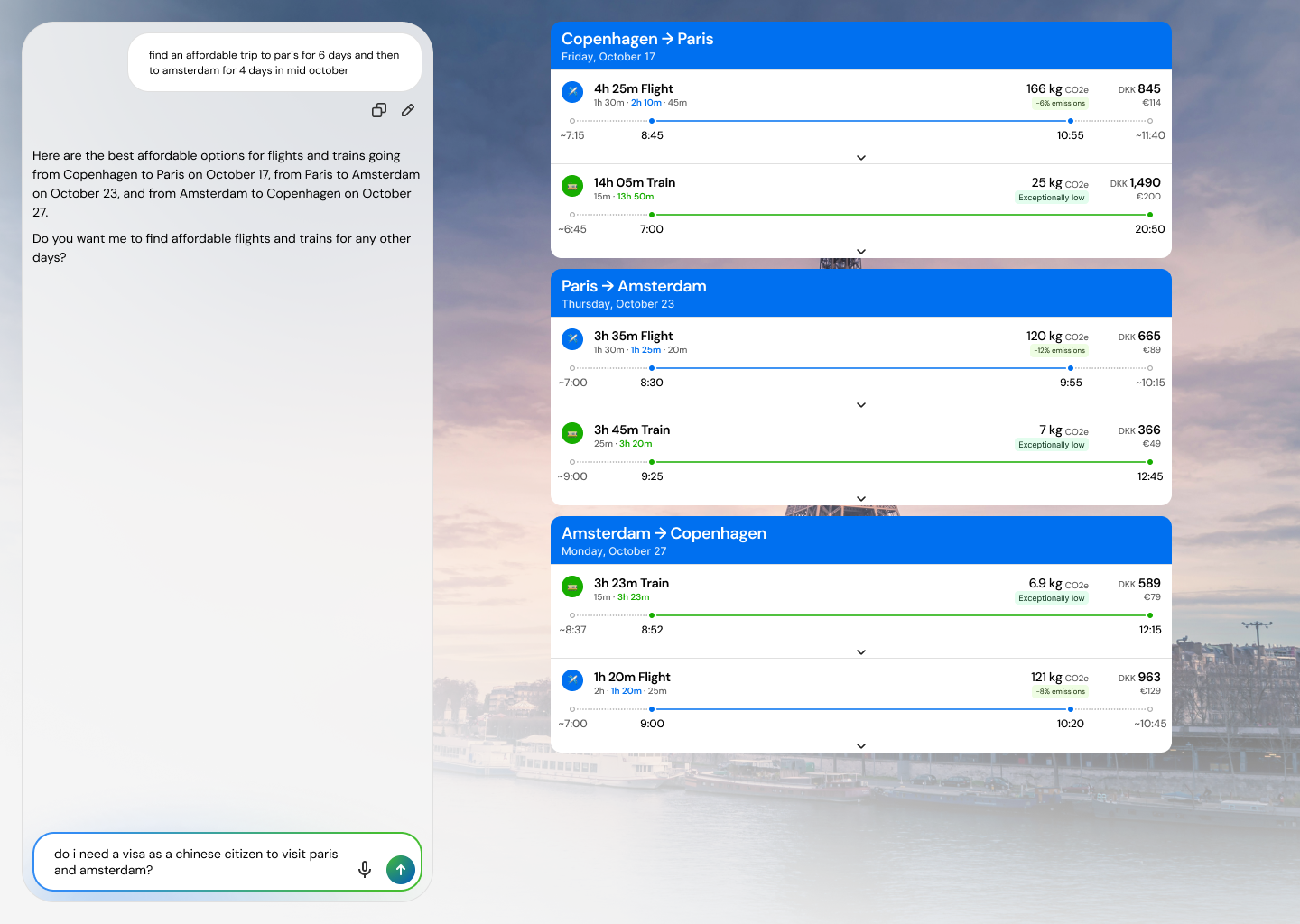
Europe in one thread: flights and trains together, multi-city loops, every suggestion inspectable — the model composes, it isn't the source of truth.
I scoped to Europe on purpose. Intercontinental ambition looked impressive and made the product worse: weaker rail, messier data, and a promise we couldn't keep as three founders. Europe is where our users already were and where rail is a real alternative, not a novelty.
Fly versus train had to live in one thread, including sustainability beside price — otherwise "cheapest flight" would always win by default. One conversation can hold a whole loop (Copenhagen → Paris → Amsterdam → back) and land as inspectable legs with plane and train options per segment.
Inspectability was the trust decision. Magical chat that hides the itinerary fails the first time a price or connection is wrong. I treated the model as a compositor, not a source of truth: every suggestion points at a concrete itinerary; no false precision; no locked destination until the traveller is ready. People forgive a slower answer if they can see why it was chosen.
Model composes; the itinerary stays inspectable.
Result
Shipped as a working proof-of-concept conversational planner for affordable Europe routes: one thread, inspectable cards, quieter than booking forms. We tested with nomads, backpackers, and young travellers; qualitative feedback showed reduced planning overhead when constraints stayed editable mid-thread.
Remaining work is data coverage and freshness — not another UI layer.
Don't out-search Google. Out-ease the planning.