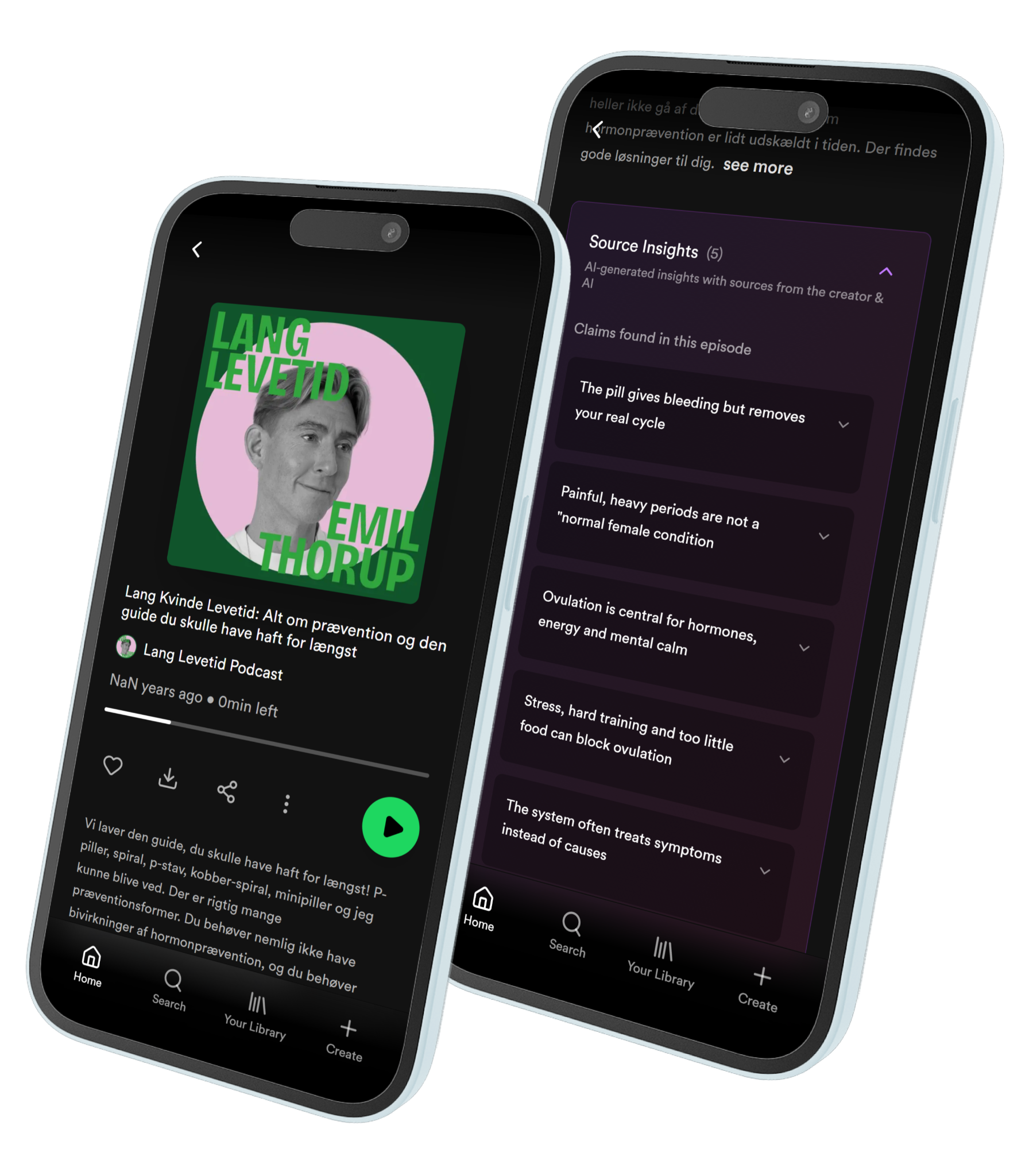
Designing Source Insights to Add Nuance After a Health Podcast
Health-curious listeners often finish a longevity episode with a claim still ringing in their ear and no way to sit with it. Source Insights is a post-podcast layer inside Spotify: each claim from the episode can be opened, then read against the host's own sources and against supporting and opposing sources the model found. The AI does not score the claim. It makes the disagreement visible.
My role
UX Designer — group project at ITU Copenhagen
Impact
Claims, not a recap
Isolated statements are what go wrong in a health podcast, not the episode as a whole. The interface extracts four to six claims from the transcript and audio so uncertainty shows up where it actually lives.
Support and contradiction in the same card
Every claim carries the creator's sources, supporting sources, and opposing sources. Medical evidence disagrees; the UI is honest about that instead of picking a winner.
After listening, not over it
People listen while cooking, commuting, training. The module waits under the episode description so the podcast can stay a podcast.
Problem
Lang Levetid sits in a high-stakes corner of Spotify: health and longevity, where a casual sentence can sound like medical advice. Evidence-oriented listeners did not want a system that called claims true or false. They wanted context they could use to form their own view.
They also listen while doing something else. A mid-episode interruption would fight the medium. The gap is after the credits: unanswered claims, no sources in reach, and a share button sitting right there.
Approach
I placed Source Insights on the episode page, under the description, as a collapsible module in Spotify's own grammar. Open it and you get four to six claims. Open a claim and you get a short plain-language restatement, then three stacks: the creator's sources, supporting sources, opposing sources. Open a source and you can leave for the original, or stay for a short AI summary of what it actually found.
No green, no red, no true/false. Colour that usually means correct would make the model look like a referee. Creator sources stay distinct from model-found ones, so origin is always visible.
The interaction is optional and a little slow on purpose: each expand is a pause before a conclusion.
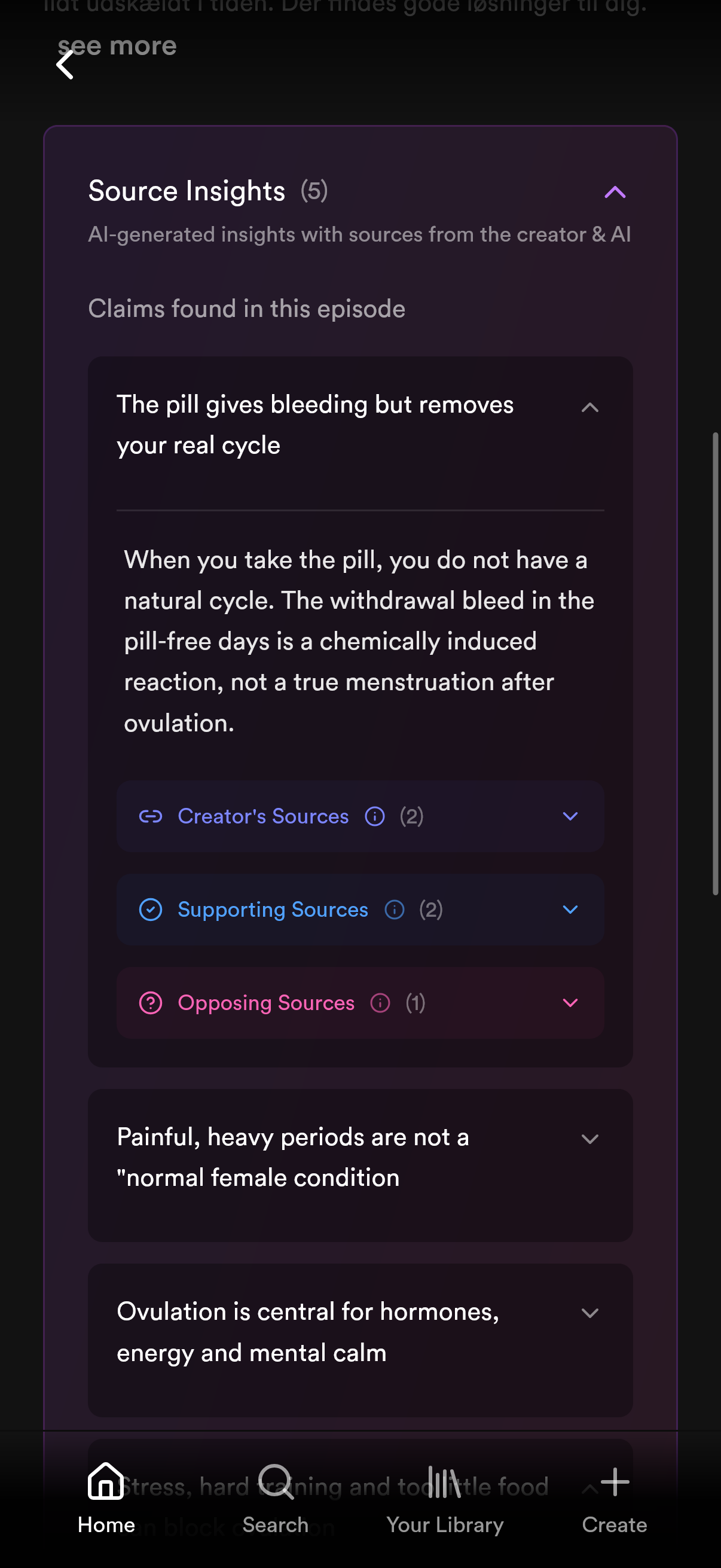
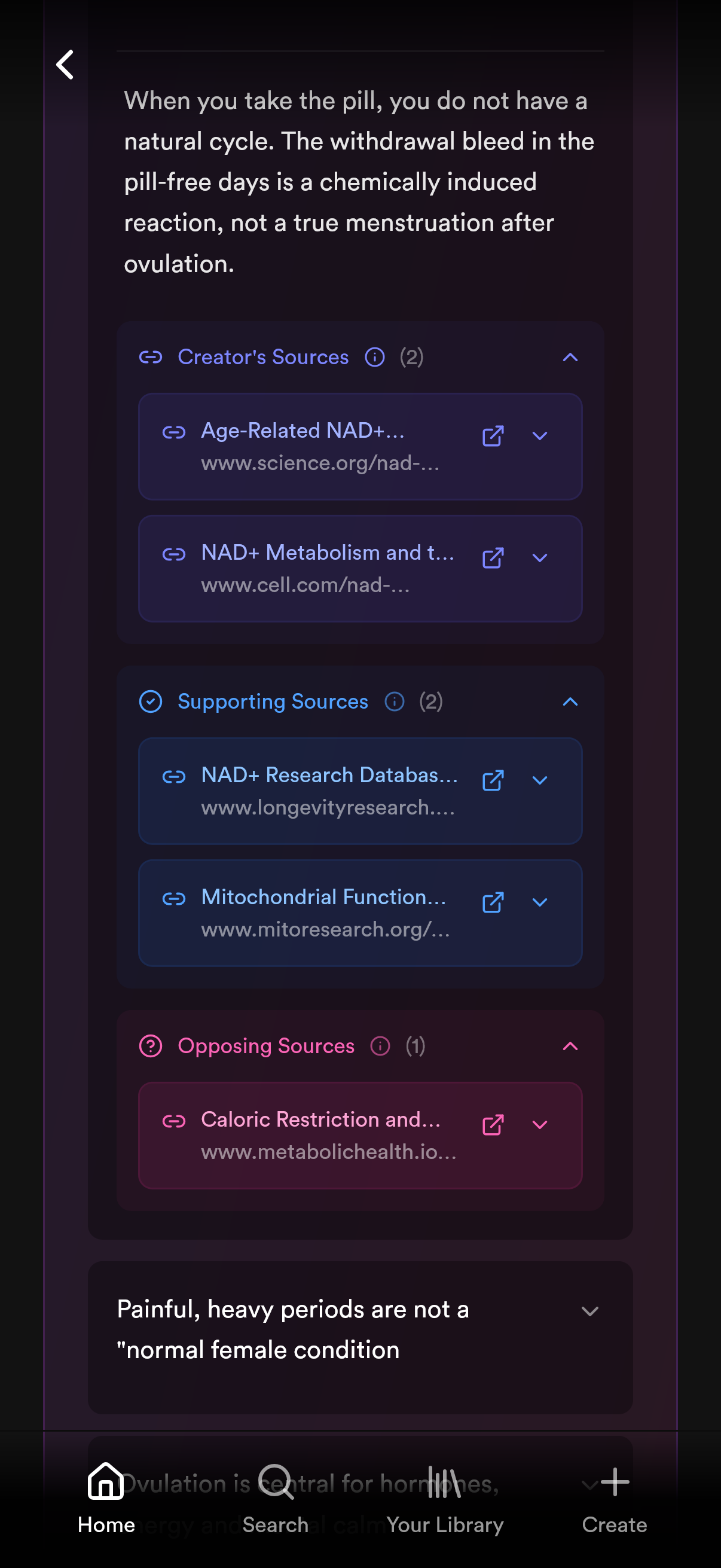
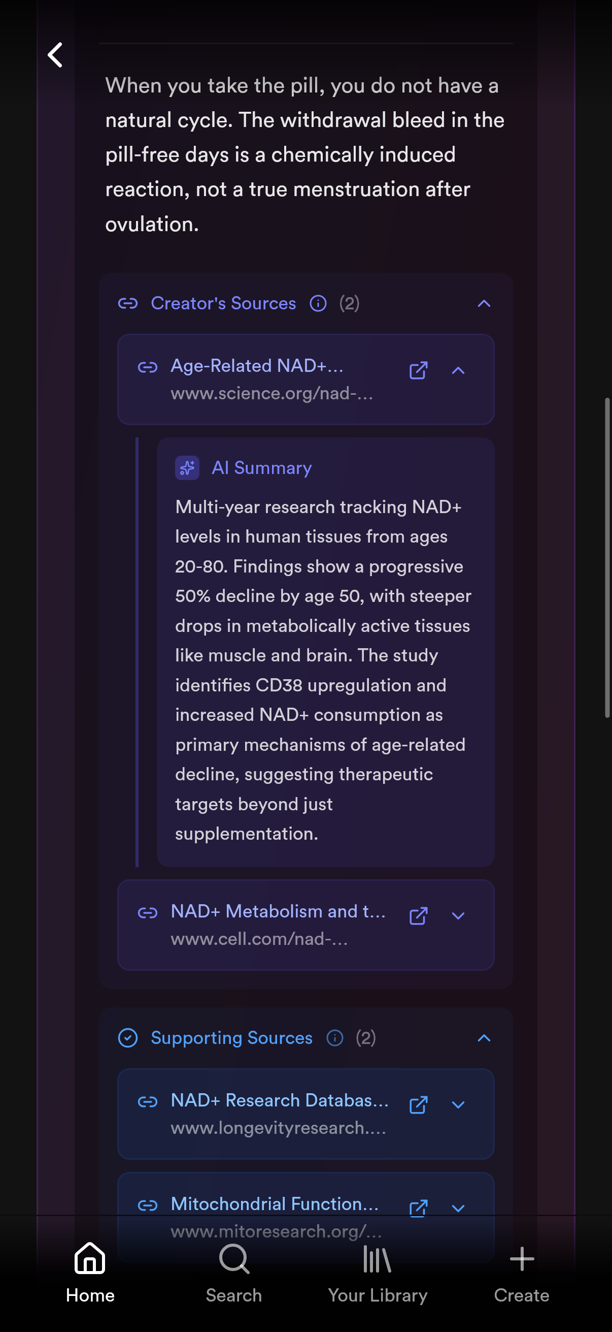
A claim opens into creator, supporting, and opposing sources — disagreement stays in the episode, not in a separate fact-check product.
After, not during
The design space split cleanly into interventions during listening and interventions after. Interviews said people listen alongside other activities, so real-time claim validation would be a poke in the ear.
We tried putting creator sources into the transcript anyway. Testers got lost and the reading flow broke. We pulled them out. Source Insights waits until the episode is over, which is when the evidence-oriented listener actually wants to go looking.
The model is not a referee
Generative output can be incomplete, contested, or overconfident. The interface treats that as a design material, not a bug to hide.
Each insight therefore carries supporting and opposing sources. There are no truth labels and no traffic-light colours, so the model cannot pretend to have judged the claim. Testing still found "supporting" and "opposing" themselves unclear — we added an explanation rather than a verdict.
What the primary listener needed was not a score. It was a way to see disagreement, then decide.
Result
Source Insights shipped as a high-fidelity Spotify markup: claim-level context after listening, sources you can inspect, summaries that make a paper skimmable. What remains is not another UI layer. It is discoverability (testers missed the module on a familiar episode page), clearer language for the source categories, and better criteria for which papers an evidence-oriented listener actually wants.